741.6092 / Workshop Notes
Yesterday I held the second of two workshops on the 741.6092 project. Students brought their alternative 'library cards' to the session complete with the extra data about the designers. This included photos of the designers, their sex, place of birth, the timeframe of their career and some practice-related keywords.
The workshop today was about data discovery. We used the creative organisation of the cards on the walls to create new readings of the information about the collection. We used L.A.T.C.H (Wurman, 2001) because it's familiar to the students already and this serves as a great refresher. It’s also a very accessible method. We can work through the letters one-by-one. As Wurman has said, ‘each method of organisation creates a new structure’ enabling us to consider a new perspective on the whole.
T is for time
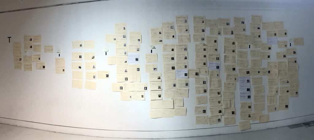
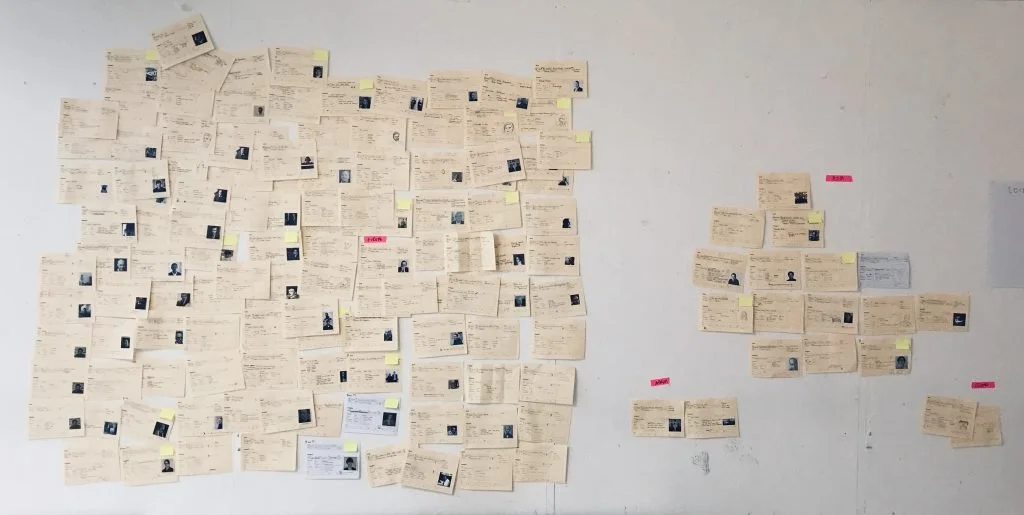
The first exercise was perhaps the simplest (which is why I began with it). A simple T for Time on the wall in tape and a series of tape strips. This replicated the timeline on their library cards. Students then placed the designers in the area that represented the peak of the designers career.
This was ill-planned as I realized that it wasn't exactly what I had asked them to capture. This needs considering in the design of the library card. The span of the career is one thing but the peak is another entirely. Adding this level of info would make the research task quite a bit more in-depth for the students.
We managed to navigate this confusion, creating a pretty interesting portrait of design history. We were able to see (and have conversations about) the origins of graphic design and the artists that shaped it, the birth of graphic design as both a term and an industry. WWII, post war, modernism and it's relationship with consumerism and material culture. The shift from individual designers to collaborations and studios.
Todays workshop was a real eye opener to the way in which the Graphic Design industry is shaped and how it has changed over time. It was really interesting to visually see the steady rise of female designers and collaborative design.
I was very much ad-libbing here because while I had a hunch about what the data would show us, I had no idea that it would throw up so many useful starting points for talking about the evolution of the discipline. For the Students, particularly the ones who have not studied graphic design before, this was a real bonus. Also well-timed as 'more design history' had come up just that week in student feedback! Collaboration and studios was an interesting moment for me personally it's not something I would have noticed in the data had the students not pointed it out.
T + H
We then reworked the timeline. Time stayed on the horizontal axis and the vertical became a Hierarchy representing the length of a designers career. We stopped to consider the people 'at the top' of the wall; the people with the longest careers. We reflected on whether they were designers we had heard of.
This was fascinating because some designers, students had definitely heard of. Others were virtually unknown. Some students on the course never studied Graphic Design before so this led to a discussion about where we get our references from. In future sessions we might use the practice keywords here as a category to see if that reveals anything about the type of practice as it relates to 'fame.'
T + H + C
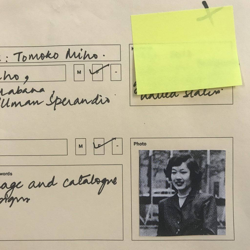
I then asked students to label all the women as a distinct category. They added crosses to the corners of the cards which I followed up with small bright yellow post it notes. We could then see that nearly all the designers with the longest careers were men. Women over-indexed in the mid to short range sections. We had a discussion about why this might be.
One designer who stood out was Tomoko Miho, both for being an Asian woman and for the timeframe she was working in. She was an unknown designer to everyone in the room and for some seemed to represent a sort of success story on many levels.
After this section I asked the students to spend some time with the data and note down any observations or questions that came to them on a sheet on the wall.
Here’s what they wrote:
L
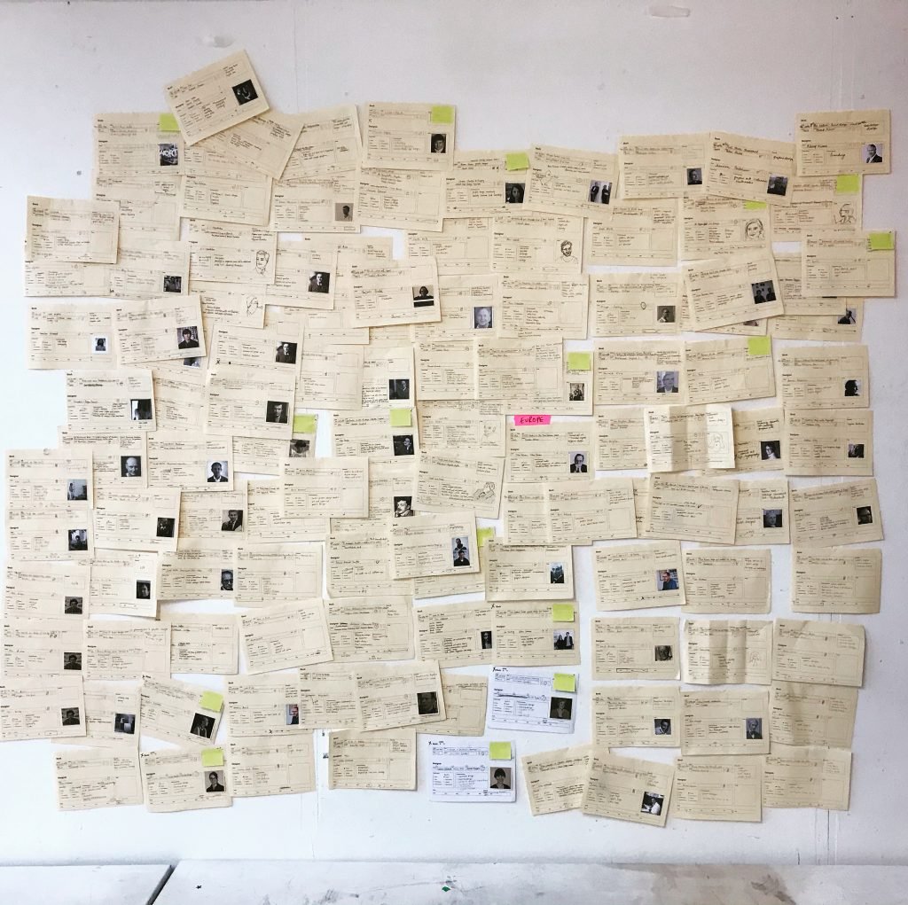
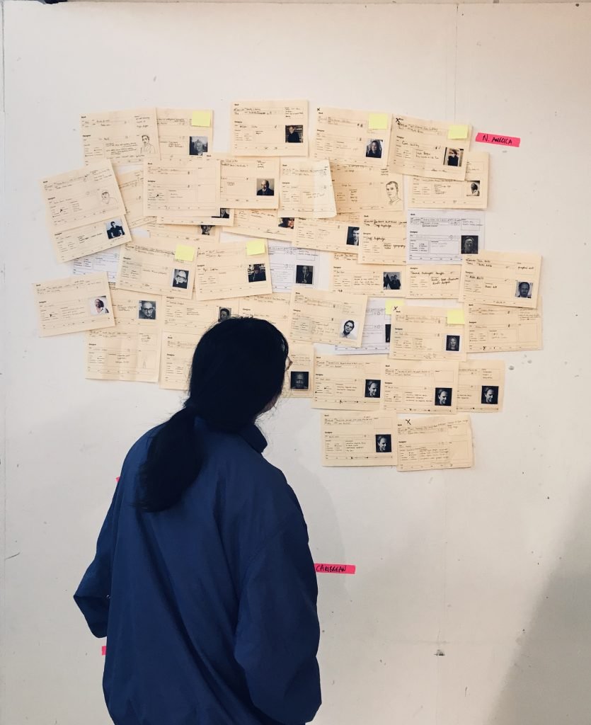
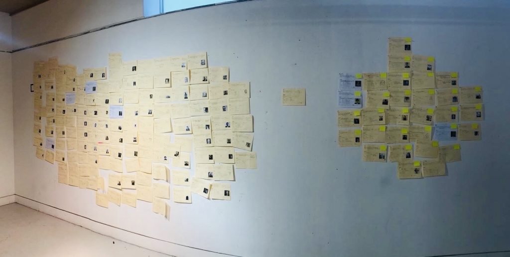
We then moved to a different wall where I had taped out an L for Location. I asked students to imagine the wall was a map of the world and place all the cards in their relevant geographical positions using the designers place of birth.
This is a blunt instrument in terms of categories, particularly for designers who were born in Europe but moved to the United States during and after WWII. However, I had to make decisions about the levels of complexity as it was overall picture and not granular detail that was the focus here.
The picture here was as I had expected. However it was particularly powerful seeing it on the wall. The sheer volume of cards in Europe, overlapping, competing for space, spanning floor to ceiling. The gaping white wall spaces that represented Central and South America, the Caribbean and Africa. It was really sobering.
One very funny moment here was how the cards revealed that very few students understood the difference between North, Central and South America. We had to re-label a lot of the cards where designers from the USA were being misplaced. This was a great learning point. A time to remind the students about data biographies. The need to question the data collection and collector and not blindly accept whatever it is telling you as fact. It was also just an amusing leveler. As the only person who has lived in Central America I was perhaps particularly ‘offended’ (in the most light-hearted of ways).
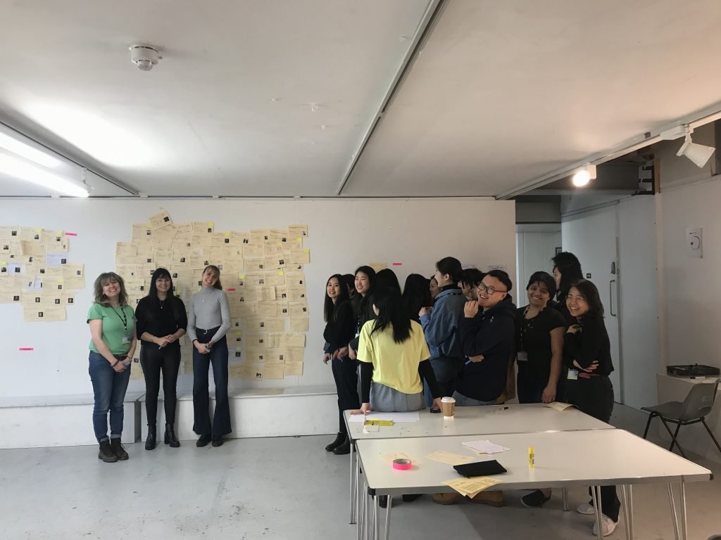
I asked the students to stand next to the region they came from. 18 students stood next to an area of the wall with just 15 cards. None of these cards actually represented their countries (the Asian designers in the collection are overwhelmingly Japanese whereas most of the students are from China, Korea and Taiwan). 3 students stood with the mass of cards representing Europe.
At first, we all had a good laugh about this but later in the break a student (from Europe) came to talk to me about how emotional she had found that experience. She talked about the difference between understanding something intellectually and then actually seeing and experiencing the idea physically. She felt upset, angry and a little ashamed. Other students commebted that they felt Asian design scenes were newer, therefore, it was perhaps not surprising that they werent featured in the library. That said, it had made them mindful of the need to seek out new references.
L+C
The earlier labelling of men and women served us well here as students started to observe the balance of male to female designers in different regions. For example, there were only 15 Asian designers represented, however 4 of them were women. Some students felt was a slightly better ratio than both Europe and North America.
Again, I asked the students to spend some time with the data and note down any observations or questions that came to them on a sheet on the wall.
“Why is the whole African culture missing” and “Is it because of how we define it? Can we redefine it?” are particularly powerful moments. Some students referenced the reading for this session at this moment:
Classifying traditional craft as different from modern design deems the histories and practices of design from many cultures inferior. We should aim to eliminate the false distinctions between craft and design, in order to recognize all culturally important forms of making.
C
For our final exercise we separated male and female designers as categories.
Again, this binary might be considered narrow as it focuses on biological sex and not gender. There was a third box on the card for anyone not defining within a binary but none were ticked. This is not necessarily a representation of reality. It depends very much on students interpretation of gender, their readings of how designers present or the ways that designers are described in literature. There’s probably a level of nuance around gender that is sacrificed for the process here.
As this was a theme we had already identified, this was really just about making it visible, and it was visible. Again students stood next to the gender they identified with. As with the place of birth category, conversation here came back to comparing the canon as it’s represented with the demographic of the student body.
I found it fascinating to consider the population at UAL compared to the designers represented in our library. We learned that about 60% of Graphic design students at UAL are female, yet a very small percentage of the books at UAL represent female designers. It is also evident that there is a very large Asian community at UAL, yet there are very few books about Asian designers.
C + C
We then went for category (sex) vs category (individual/studio) and saw again the prevalence of the ‘individual white male’ designer. Relatively few individual women. We also noted the trend in mixed-sex collaborations and studios more recently in design.
“The history of design is being told as the history of genius individuals (predominantly white men), who driven by their determination and ‘genie’ managed to reach the highest positions in the hierarchy of the discipline. The historical, social, political context is disregarded and we are taught that we too should work as individuals in order to achieve our professional goals.”
Maya Ober, Expanding Knowledges: Pedagogies of Freedom for Visual Communication
I again asked the students to note down observations and questions they had based on the data.
Personal reflection on the session
Redesign the card
There’s quite a few things I would change about the design of the library card in hindsight. I have noted a few of them but this session threw up the need for a bit more thought and clarity in what’s being asked for.
Facilitation
It struck me often how you really need to think on your feet in this session. You need a fairly good understanding of design history to facilitate the process as you really have no idea what will come out in the data and you need to be prepared to facilitate the conversation around it. I wonder how different people might manage this challenge. It also just struck me that this is an interesting process to use when teaching design history as the variables are infinite.
You also have to be mindful to point out mistakes in the data collection and the failings of the library card. It’s a great way to talk to students about designing research and methods. The quality of the insights heavily influenced by the quality of the data collection process. There are things to note about correlation and causation so it’s important to keep the level of question at ‘what are some of the potential influences here?’
It’s also important to deal with the scope of the data. This is after all just the collection at one college, it doesn’t represent everything available. Here it’s good to address the ways that the Library orders its books and the nature of the publishing industry.
Student reflection on the session
I think this provides me many other perspectives to consider what I should do in the future as a graphic designer and how to treat mainstream design thoughts and other alternative cultures.
I found it very insightful, to see, how bad the situation really is and how the canon lacks diversity. While it is interesting and important to write and read about these topics, this session proved to me, that an even more effective way to raise awareness, is to actually make people “see” and “feel” issues, by making them visible.
References
Khandwala, A. (2019) ‘What Does it Mean to Decolonize Design?‘, AIGA Eye on Design, 5 June 2019.
Depatriarchise Design (2019) Expanding Knowledges: Pedagogies of Freedom for Visual Communication.
Tuck, Eve & Yang, K.. (2012). Decolonization Is Not a Metaphor. Decolonization. 1. 10.25058/20112742.n38.04.
de Sousa Santos, B. (2018) The End of the Cognitive Empire: The Coming of Age of Epistemologies of the South. Durham and London: Duke University Press
Wurman, R. S., Leifer, L., Sume, D., & Whithouse, K. (2001). Information anxiety 2. Indianapolis, Ind, Que.
