741.6092 / Workshop Design
What is the most important practical contribution of systems thinking to the world? It’s the use of methods and tools that make the system see itself — i.e., that make people in the system see the patterns that they collectively enact.
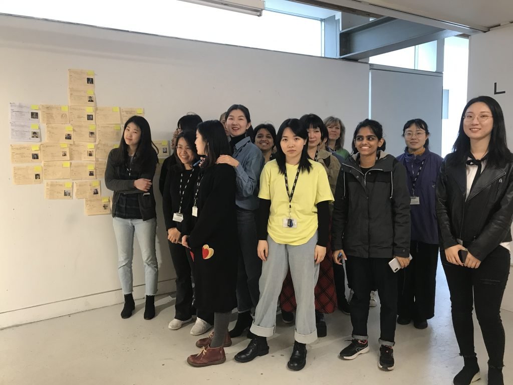
I ran the 741.6092 project on the Graduate Diploma Graphic Design at Chelsea College of Arts in the Spring Term. The overall aims of the project were to create tangible links between theory and practice for graphic design students and also build students confidence in working creatively and critically with data.
One of the assumptions of the project is that an academic library operates as a site of power. Considering what is represented in it might makes some of the assumed 'norms' and privileges underpinning disciplinary knowledge more visible to us.
As library collections catalogue authors rather than designers, there is often a missing layer of data when we come to consider these issues. The data is capable of telling us about who is writing about the design, but not necessarily who is designing. Therefore, this project focussed on countermapping this missing layer of data and working with it to understand its patterns and implications.
What follows here is the design process behind the project. It was written for my assessment on the PGcert but I've also included some of the pitfalls and limitations of my process to assist anyone thinking of running a similar project.
The project is underpinned by the following principles of Data Feminism:
#1 Examine Power - analysing how power operates in the world
#2 Challenge Power - challenging unequal power and working toward justice
#4 Rethink Binaries and Hierarchies - challenging the gender binary, along with other systems of counting and classification that perpetuate oppression
#6 - Consider context - asserting that data are not neutral or objective. They are the products of unequal social relations.
The question
Who are the designers represented in section 741.6092 of the library at Chelsea College of Arts?
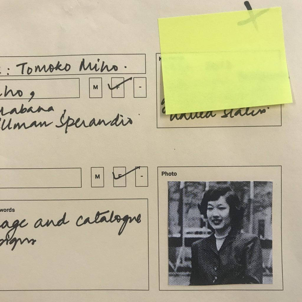
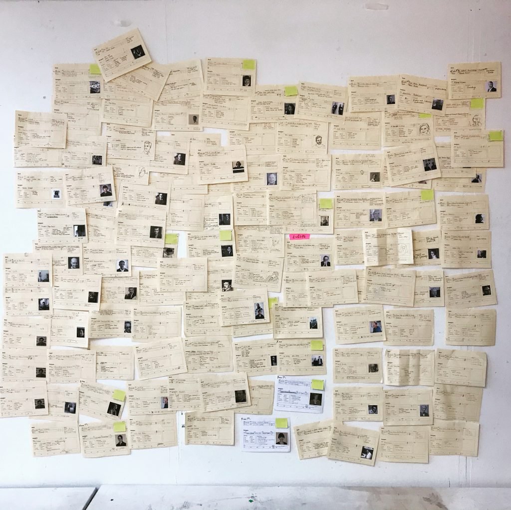
To begin to explore the who questions question, I requested a spreadsheet of the catalogue records for 741.6092 from Siobhan Britton, the Graphic Design Subject Librarian at Chelsea. I then divided the collection between the students giving them each 10-12 books.
Deciding on data
When designing the data collection process, it was important to be clear about the data we were collecting. Most important here was to focus on data that was actually collectable. To do this I broke the main question into sub-questions.
We started with these:
Where were they born?
What gender are they?
When did they live?
When did they practice?
What type of work did they do?
How did they do it?
Consider the formats
This is about deciding the type of data that will be recorded and in what format.
Who - [Photo]
Where [Location > Region]
What [Category > M/F/NB]
When [Time]
What [Category > Individual/Collective]
What type of work turned out to be a question that demanded more research time than was available for the project. The result was that they were for the most part were left blank by the students. Time and complexity are key. If you are asking for data that requires the student to read the entire book to understand, it's not likely you're going to get the data! Which is exactly what I found. It is also highly subjective. It generated multiple variations on categories that were very hard to sort through. We didn't end up using this data at all.
Test your method
Hands up, I didn't test the library card. So, I missed a couple of important opportunities. The main one being that I only included the option to collect world-region information for location. Thankfully, a lot of students saw fit to record the country as well. Leading to some really interesting insights. I might have avoided this by putting it in front of someone first. So next time, I will test. Like I always tell my students to…
Designing the workshop
Next I thought about how the students could work together to explore the data. Data in it's raw form is really quite useless. To get anything out of it, we needed to spend some time with it and look for the patterns in it. So I designed a very simple workshop using L.A.T.C.H (Wurman, 2000:40-41) as the organising theory. We focussed on Location, Time, Category, Hierarchy and then went on to combine the options.
Visual structures
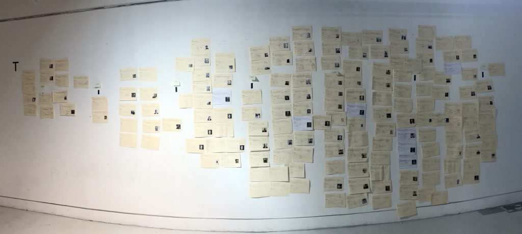
It's important to consider the visual structures you will use for the information in advance. For example, when working with Time, we used a horizontal line that went from left to right divided into 20 year time spans (note: itself a Western Visualisation bias. A great topic of discussion during the workshop)
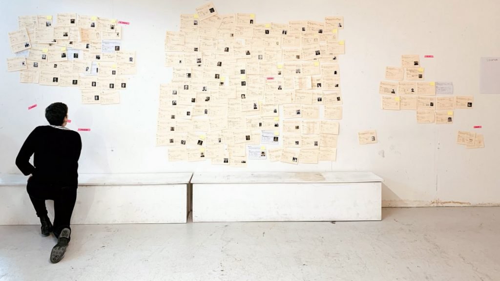
For Location we turned the the wall into a world map using a Mercator projection (again: a highly contentious map view)
These might sound 'logical.' We don't all use the same visual structures to understand the world. Your own choices will be based on your own epistemological biases. Therefore you need to be prepared to clearly explain the structure and how it works.
As you move through combinations, the structures get more bespoke. Considering the possible structures in advance mean that you don't have to do it 'live' in the workshop. I'm very used to doing this but it can be very stressful if you're not.
Planning these will will also reveal a useful order for the process overall. For example, after the timeline was a good time to explore gender as a category because everything was already on the wall. It was simply a case of reconfiguring it. Location however required a new wall. I find it useful to mind map all the possible configurations in advance to consider the most useful visual structures and the sequence of them.
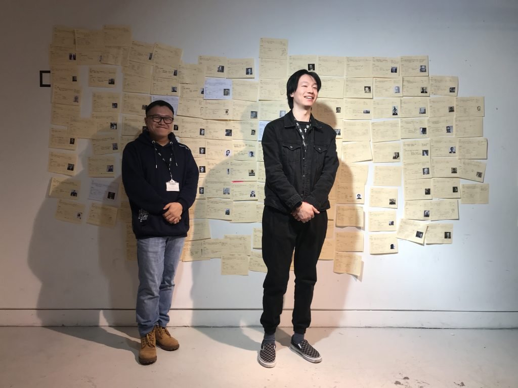
A few times I asked the students (if they felt comfortable to do so) to 'stand with their category.' This was an in-the-moment decision but it was useful. It's easy to forget that data stands for people. We tend to view it in an abstract way. When the students stood next to the data it altered their relationship with it. For example, it was not just that there were so few Asian designers relative to European ones, it was that Asian students outnumber European students in the class by a significant majority. In these moments, students were able to consider how the library collection represented them as a student body, not just the discipline of graphic design.
Workshop process
For each step we used the same process; designed as a reflective learning cycle.
Arrange - manually position the cards on the wall
Document - record the arrangement by taking a photo or drawing
Discuss - collectively what we can see, what we notice and what it might tell us. We also try to link what we were seeing to what we had read in advance of the session.
Record - thoughts, observations and questions individually on the wall.
After the initial discovery, students took each of the observation sheets, discussed them in small groups and added further annotations based on their discussions.
Post-workshop
Students also wrote reflections on the project as a whole for their process books. Here’s a selection of quotes from those. It’s here you start to see how the readings and the process came together.
“I found it very insightful, to see how the collection lacks diversity. While it is interesting and important to write and read about these topics, this proved to me, that an even more effective way to raise awareness, is to actually make people “see” and “feel” issues, by making them visible.”
“By just internalizing codes without questioning their accuracy, we might end up working in ways that are not representative or inclusive and we may influence the general perception of reality accordingly.”
“We have known before that the design world doesn’t have equal representation. But what was shocking was the prevalence of such a bias in an educational institution. This will only mean that this unfair bias concerning gender, culture is going to continue in the future as this is what young designers are taught.”
“We will start taking into consideration the cultural bias that our research might have, as well as make an effort to go look for resources with a wider range of cultural and social backgrounds.”
“The important takeaway from this project is the wish to contribute to changing graphic design education and help it be more diverse and inclusive. This process also made us more aware of the bias in our practice. Something we hope to consciously change in the future.”
